Customise the auth dialog
You can customise your Data API user authentication flow in Console.
For your user to share their bank account data via open banking, they need to authorise that sharing first.
A preview of your authentication flow displays on the right-hand side of the screen. Use this to check your UI updates before you click Save in the top-left to save your changes.
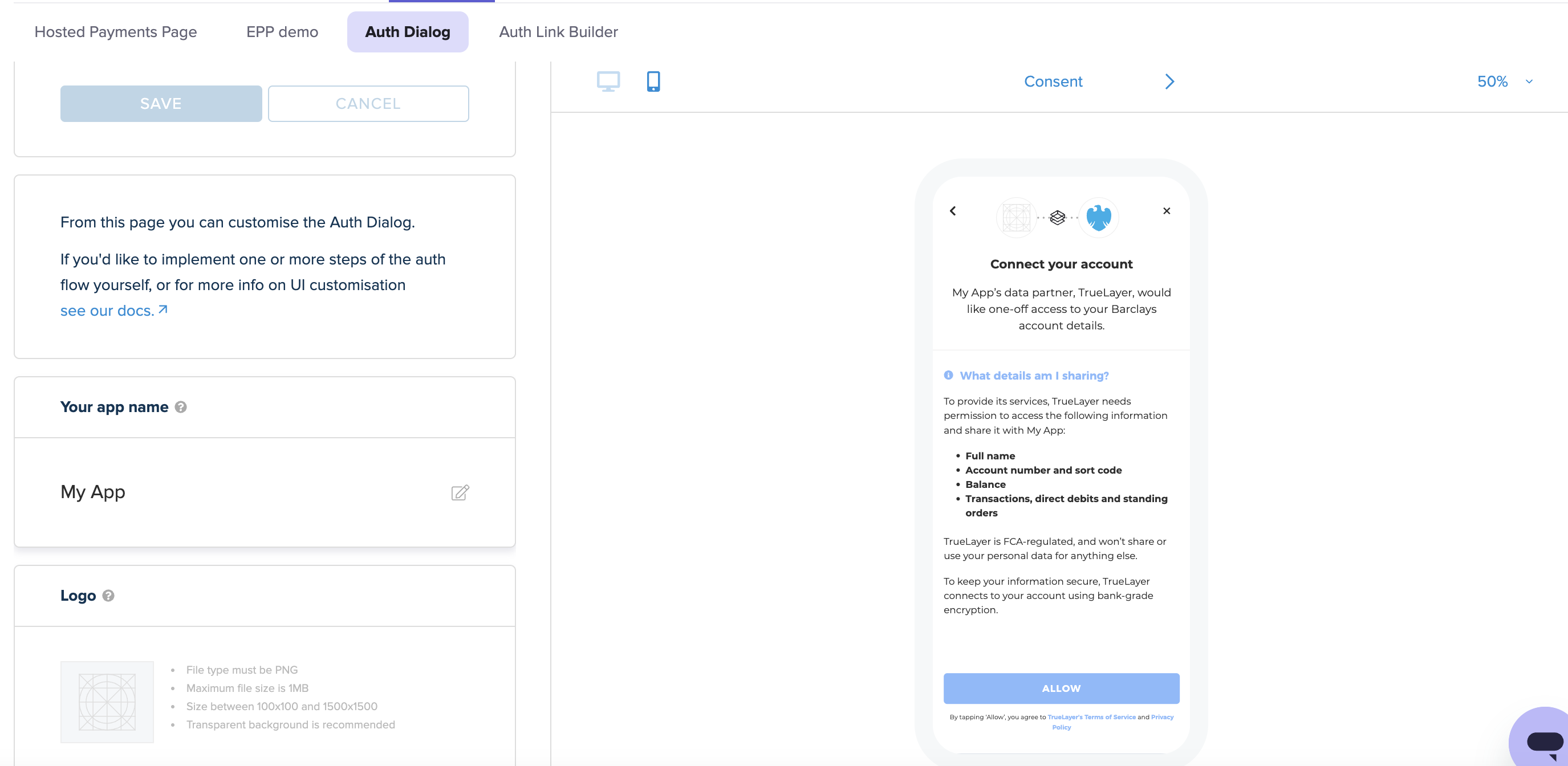
The auth dialog customisation screen in Console, with the preview window to the right.
In the bar at the top of the preview, you can:
- Switch between a desktop and mobile preview by clicking the PC and mobile icons.
- Switch between a preview of the Consent and Provider selection screens by clicking the arrows in the centre of the top bar.
- Change the zoom level by changing the percentage in the dropdown to the top right.
This table contains all of the auth dialog elements that you can customise in Console.
| UI customisation option | Description |
|---|---|
| Your app name | The name of your app. This displays in the consent collection screen, explaining what data is collected through TrueLayer. |
| Logo | The logo that displays at the top of the consent collection and provider selection screens. |
| Cancellation URI | The URI in your application that your user is taken to if they close the authentication flow and do not complete it. If you do not set a cancellation URI, the integration will take users to your redirect URI. We recommend adding an |
| Data use description | The wording explaining why TrueLayer needs permission to access user data, which displays under the heading What details am I sharing? in the authentication flow. You can either select an option from the dropdown menu, or enter a custom description. |
| Custom colours | The colours used for different elements in the authentication flow. You can change the colours by either entering a hex code or clicking the colour icons to use a colour picker. The different colour options are:
|
Updated 3 months ago