Customise the Web SDK
Change elements of the Web SDK to suit your integration.
If you are using the Web SDK, you can customise some parts of the UI to improve your user experience.
You can change your UI settings within the uiSettings object inside the initWebSdk function. For example:
Change the button size
The default size of the Pay button is large. This option includes the full container with the supporting information.
To change the size of the button, set size to 'small'. The small option displays only the button. You can use your own UI to display primer text to help your users understand the payment method.
If you don't pass a size object, or pass an empty size object, the button is large by default.
See below for an example of changing the button size:
initWebSdk({
  uiSettings: {
    size: 'small',
  },
  ...
})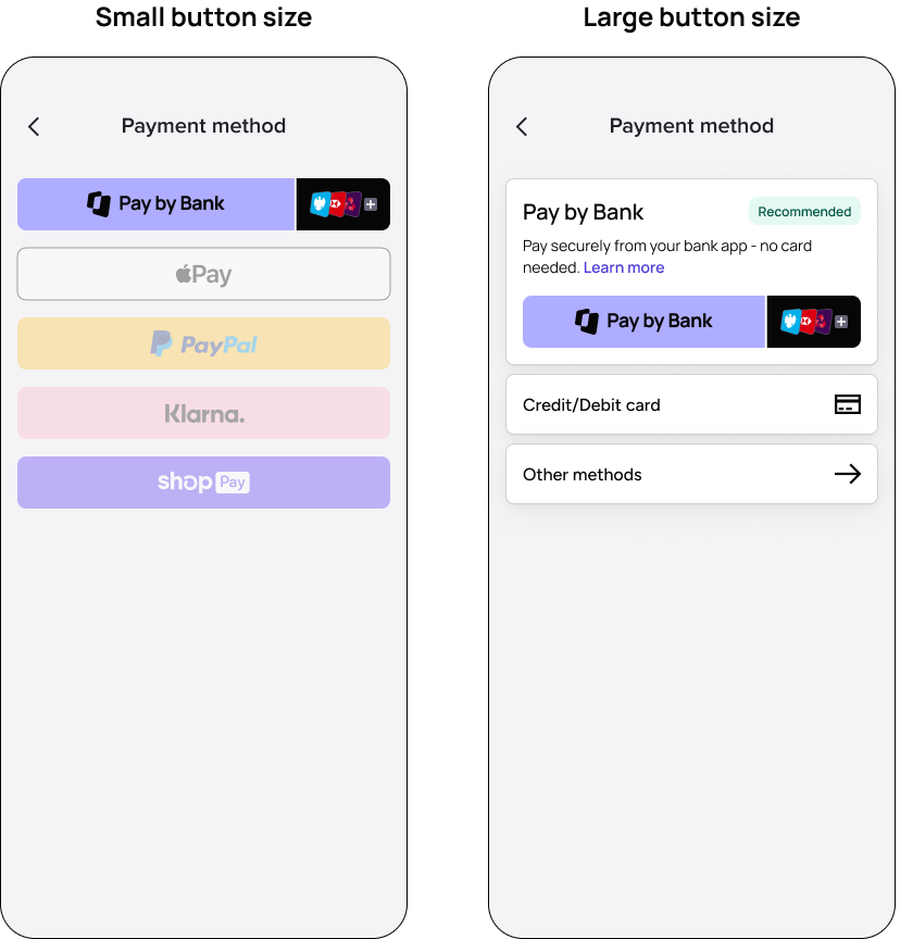
Examples of the Web SDK button UI with the large and small button sizes.
Examples of the Web SDK button UI with the large and small button sizes.
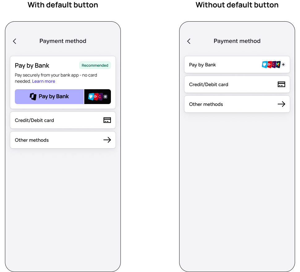
The ‘Recommended’ tag
If you want to display the Recommended tag next to the TrueLayer payment option, set recommendedPaymentMethod to true.
See below for an example:
initWebSdk({
  uiSettings: {
    recommendedPaymentMethod: true,
  },
  ...
})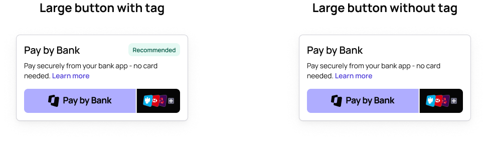
An example of the large button style with the recommended tag enabled.
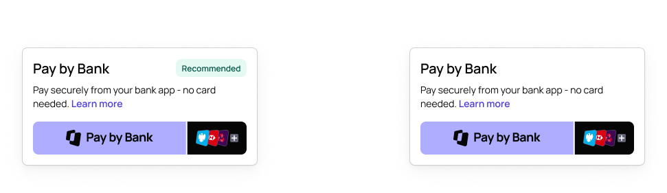
An example of the large button style with the recommended tag enabled.
Button border radius
To set the size of the border radius around the Pay button in pixels, set the borderRadius value within the uiSettings object.
We strongly recommend setting this up to make the Pay by Bank button look consistent with other buttons related to payment methods.
An example of how to do this is below:
initWebSdk({
  uiSettings: {
    recommendedPaymentMethod: true,
    size: 'large',
    borderRadius: 8,
  },
  ...
})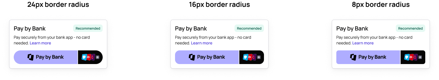
Examples of how different values for border radius display on the large button. The default for large is 24px.
Examples of how different values for border radius display on the large button. The default for large is 24px.
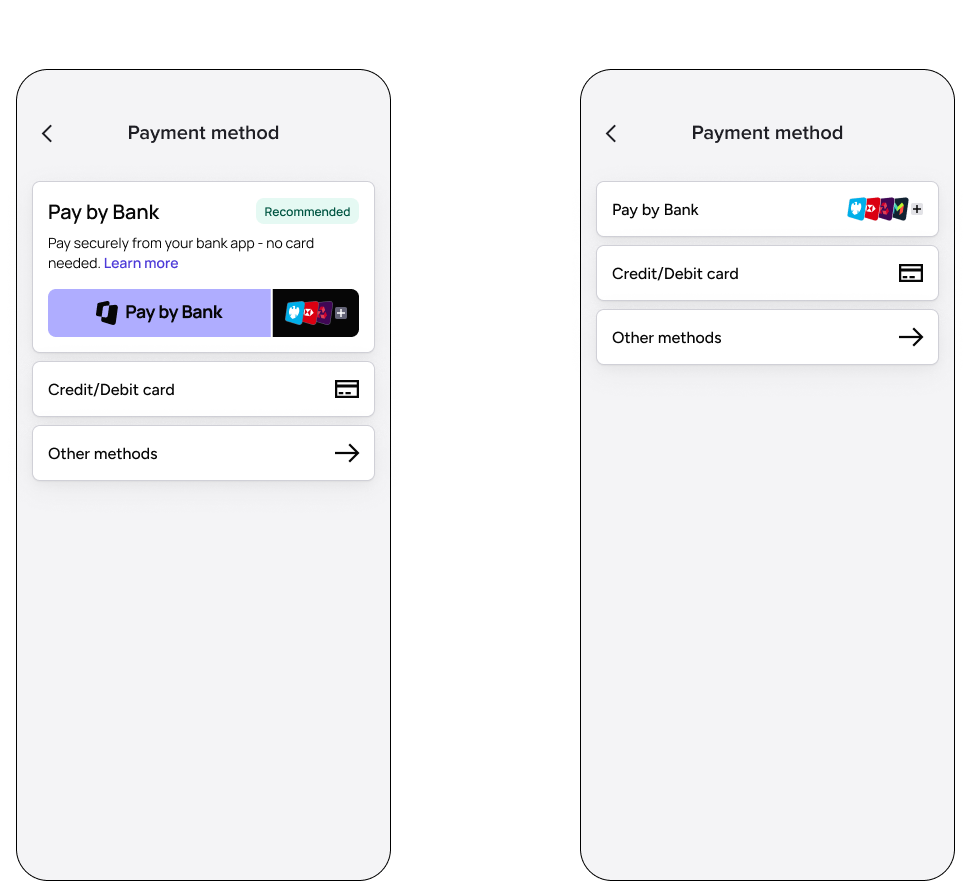
Use your own payment button
The dynamic payment button is optimised to make sure your customers recognise the payment method, see the banks relevant to them, and see their saved accounts, right from your checkout. We recommend using our payment button wherever possible.
However, if our payment button doesn't work with your checkout, you have the option to use your own button instead. For example, if you display your payment options as radio buttons, you may not be able to include the TrueLayer dynamic button.
We also recommend the buttonless web SDK if you are building a checkout which needs additional UI elements (for example, a top-up flow for an iGaming account).
An example of the default button style, and a checkout with a new button style.
An example of the default button style, and a checkout with a new button style.
To launch the payment flow from your own button, you need to:
- Initialise and start the SDK on button click
- Include the
uiSettings.hideButtonparameter.
initWebSdk({
  uiSettings: {
    hideButton: true
  },
  ...
})
Additionally, when using your own payment button, we recommend that you develop logic so the user can resume an existing payment. For example, if a user cancels the payment flow and returns to your checkout, your button should update so that it resumes the existing payment and uses the same id. You can do this by by calling the start function again.
Dynamic logos
You can only set one logo per client ID in Console. However, if you want to process payments for multiple brands, you can optionally use different logos for different payments. Do this by defining an image URL in the merchantLogoUri field.
See an example below:
initWebSdk({
  uiSettings: {
    recommendedPaymentMethod: true,
    size: 'large',
    borderRadius: 8,
    merchantLogoUri: 'https://example.org/logo.jpg',
  },
  ...
})
To make the image display properly:
- Ensure that your image is square, so that it renders properly when it is displayed in a circle
- Ensure that your image is a PNG, JPG, JPEG or SVG
- Compress your image so that it is 100x100–1500x1500 px
For security reasons, we need to allowlist the domains for your logo URLs for your account, so get in touch with us to set this up.
"Learn more" UI
If you are using a Large payment button, a Learn more link displays in the UI text. This opens a modal which explains how the TrueLayer payment method works to your end user.
If you are using a Small payment button, this link does not display, as the button renders by itself without any surroundings. Instead, we recommend that you set up an option to trigger the Learn more modal yourself, such as by creating your own Learn more button within your UI.
Return the openLearnMoreModal function when you initialize the SDK (using the initWebSdk function). You can then call openLearnMoreModal to dynamically open the modal.
See below for an example:
const { openLearnMoreModal, ... } = initWebSdk({
  ...
})

document
  .getElementById('button-learn-more')
  .addEventListener('click', openLearnMoreModal)
Updated 24 days ago