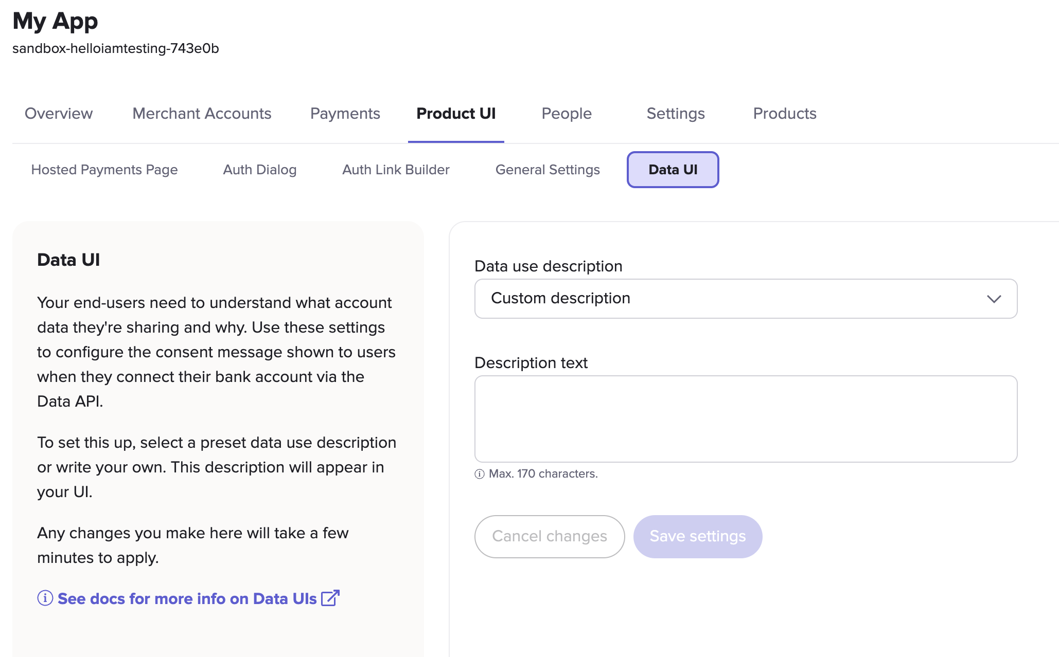
Data UI customisation
For your user to share their bank account data via open banking, they need to authorise that sharing first.
A preview of your authentication flow displays on the right-hand side of the screen. Use this to check your UI updates before you click Save settings to save your changes.

This table contains all of the Data UI elements that you can customise in Console.
| UI customisation option | Description |
|---|---|
| Data use description | A dropdown menu which enables you to choose from a set of editable data use descriptions. These represent all the most common ways to use the Data API product (for example: income verification, cashback and personal finance management). You can select the one which is closest to your own use case and either edit it, or use it as is. Alternatively, you can select Custom description for a completely blank field that you can write yourself. |
| Description text | A field where you can edit or create your own data use description. |
When you are ready to update the text, click Save settings. When you save your description, it will update across all UIs associated with the app which use the Data API.
Updated 21 days ago