Customise the EPP
Change the user experience of the embedded payment page.
The embedded payment page has a range of options you can use to tailor the user experience.
Customise the EPP in Console
Go to the EPP Demo page to customise the look and feel of your EPP right in Console.
Customise the EPP user flow
You can customise the payment authorisation flow, tailoring it to your needs and making it simpler for your users.
Page presentation
By default, the embedded payment page is presented as a modal, overlaid on top of your web page. However, you can also choose to display the EPP inline on your page, sitting next to your other web content.
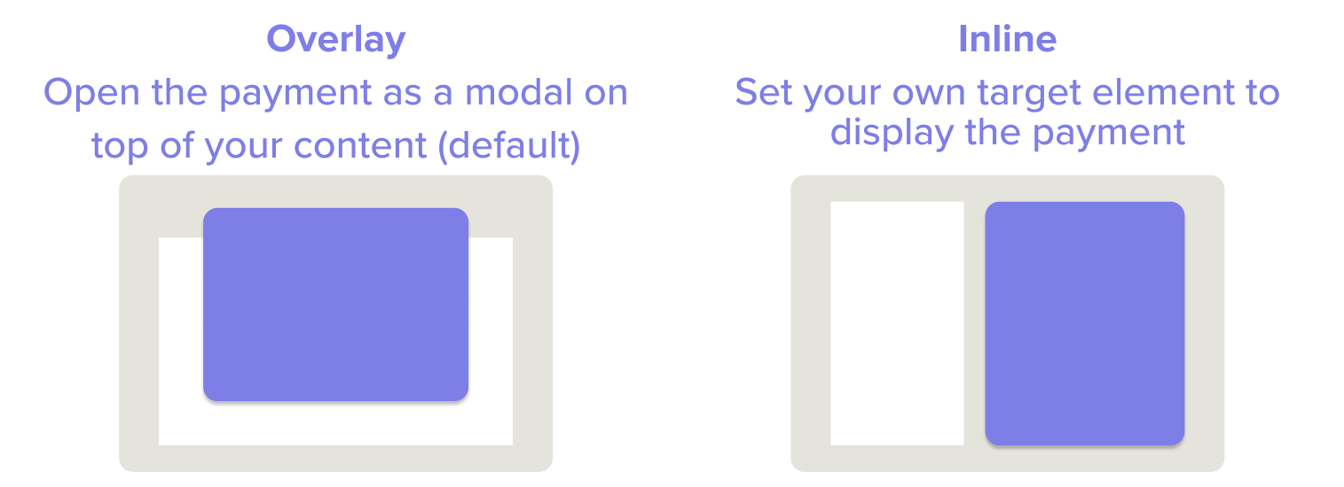
To display the EPP inline on your page, you can configure it to load inside your own web page element. To do this, set the target field when you import the embedded payment page.
When the flow is finished (indicated by the onAbort or onDone callbacks), remember to unmount EPP from the DOM.
import { Payment } from "truelayer-embedded-payment-page";

const payment = Payment({
  payment_id: "your-payment-id",
  return_uri: "your-return-uri",
  resource_token: "your-resource-token",
  // mount the embedded payment page in the target element
  target: document.getElementById("your-target-id")!,
  // remove the target element from the DOM after the payment is done
  onDone: () => {
    const target = document.getElementById("your-target-id");
    if (target) {
      target.remove();
    }
  },
  // remove the target element from the DOM if the user aborts the payment
  onAbort: () => {
    const target = document.getElementById("your-target-id");
    if (target) {
      target.remove();
    }
  },
});
Ensure that the EPP displays correctly by setting your target node to at least 320 px x 320 px in size.
Country selection
The currency of a payment controls which countries a user can choose to pay from. For example, if the user is making a payment in euros, they will be able to choose between countries that use the euro to pay from.
To help simplify that choice, EPP will pick a default country based on the browser locale, but allows the user to switch to a different country if needed.
Control which countries your user can choose from by setting a provider filter when you create the payment with the Payments API.
Provider selection
On the selection screen, the user will see providers sorted by the highest market share first.
Providers are also assigned a release channel based on the maturity level of our integration with them. You can choose whether or not you want to include those that are in a beta release channel by using the provider filter when you create the payment with the Payments API.
Language
The EPP selects the best language to display the user interface in, based on the browser locale.
It supports the following languages:
- English
- Spanish
- French
- German
- Dutch
- Portuguese
- Polish
- Finnish
- Lithuanian
If you need to, override the automatic language selection by specifying the language property using the ISO Alpha-2 code format:
const payment = Payment({
  ...,
  language: 'fr'
})
Let your user choose the payment scheme
When accepting payments in EUR, many banks offer a choice of two schemes, or payments rails to send the payment over: SEPA Credit and SEPA Instant. SEPA Instant is faster, but it can sometimes come with a fee that the bank will charge to your user. For this reason, the Payments API enables you to handle scheme selection in two different ways:
- Choose which scheme your user will pay with, or set a preferred scheme by default
- Have your user choose which scheme they want to pay with
With the user_selected scheme option, your user chooses their banking provider and is then asked which scheme they would like to pay with. For many banks we show an indication of the fee. If SEPA Instant is available for free, the payment is initiated on that scheme automatically.
We recommend this feature for markets where fees for SEPA Instant payments are high and prevalent. For example, in these geographies:
- Spain
- Portugal
- France
- Austria
Use dynamic merchant logos
If you process payments for multiple different brands, you may want to use multiple different logos.
To create a payment with a different logo to the default, pass a merchant_logo_uri parameter when you initialise the library. For example:
const payment = Payment({
  ...,
  merchant_logo_uri: 'https://example.org/logo.jpg',
});
To make the image display properly:
- Ensure that your image is square, so that it renders properly when it is displayed in a circle
- Ensure that your image is hosted on an
httpsdomain - Ensure that your image is a PNG, JPG, JPEG or SVG
- Compress your image so that it is 100x100–1500x1500 px
For security reasons, we need to allowlist the domains for your logo URLs for your account, so get in touch with us to set this up.
Signup+
If the payment is part of a Signup+ onboarding flow, then you may want to use the EPP to explain what additional data is collected, and how it's used.
If you set the Signup+ option to true when you start the payment flow, the Review Payment screen shows an additional message.
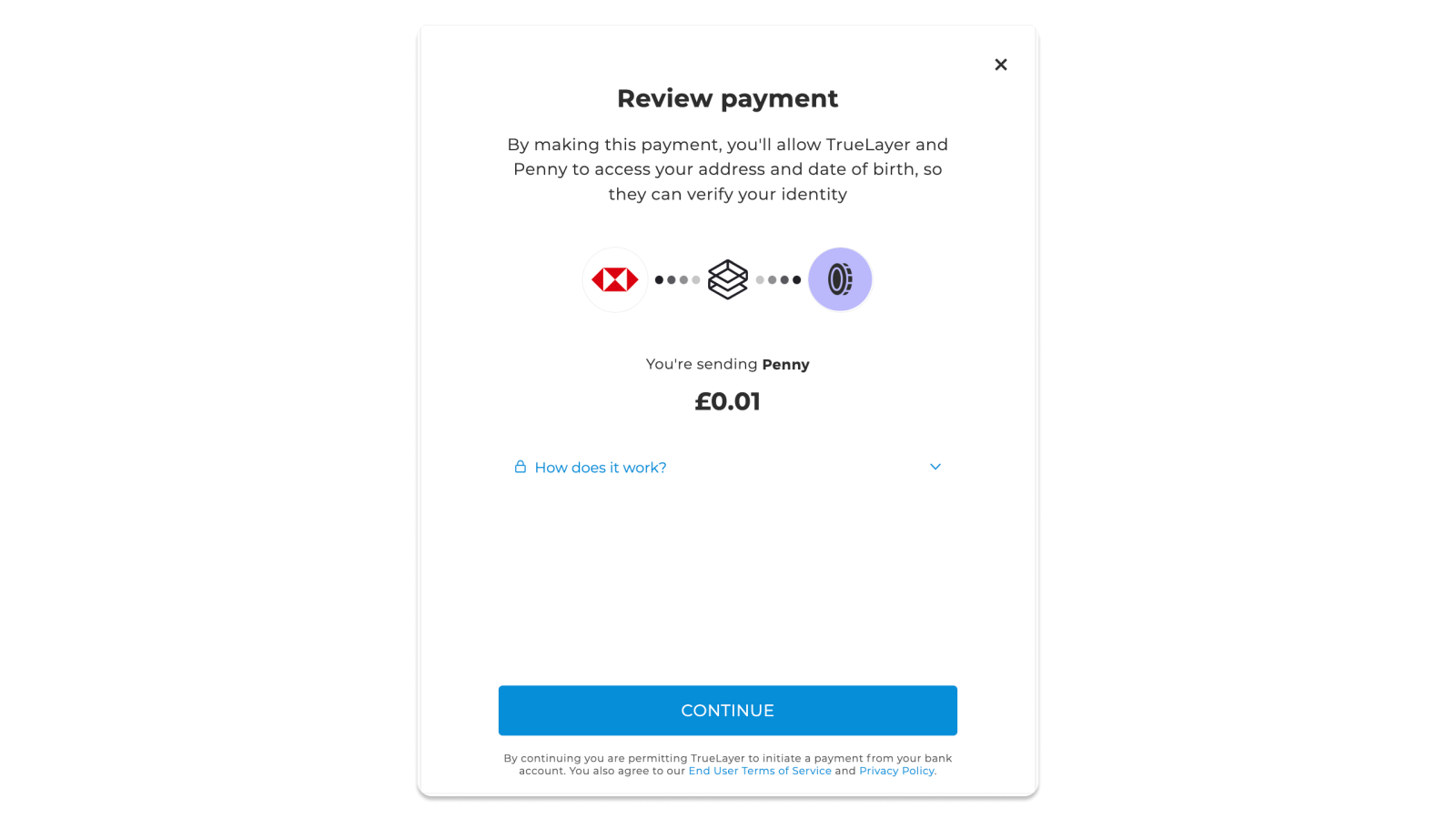
Here's how to enable the Signup+ message.
import { Payment } from 'truelayer-embedded-payment-page'
const payment = Payment({
  payment_id: 'example-string',
  resource_token: 'example-string',
  return_uri: 'example-string',
  signup: true,
})
payment.start()
Additional inputs
Some banks outside the UK require additional information about the payer in order to initiate the payment. That can include their branch or their IBAN. In these cases, the EPP asks the user to enter these details.
A limited number of banks also require that the user log in to their bank account through the EPP screen, which it handles securely.
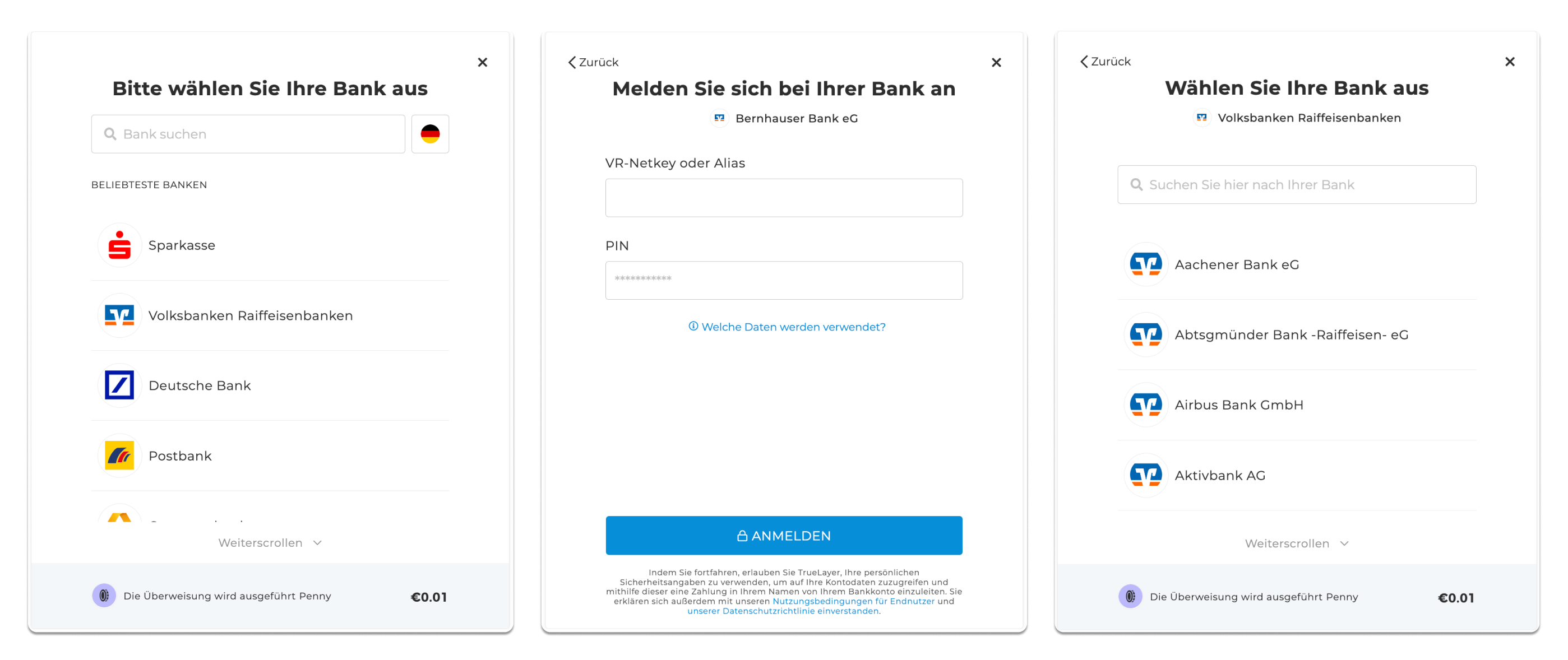
Entering their IBAN can be a source of friction for your users, but you can simplify this process. If you already have a record of your user's IBAN, then you can provide it to the Payments API when you create the payment to prevent the user from being asked to enter it. This is done using the preselected type of provider_selection. See our documentation on provider selection for more information.
Bank redirects
In most cases, users are redirected to their provider so that they can authorise the payment.
See below for redirect options.
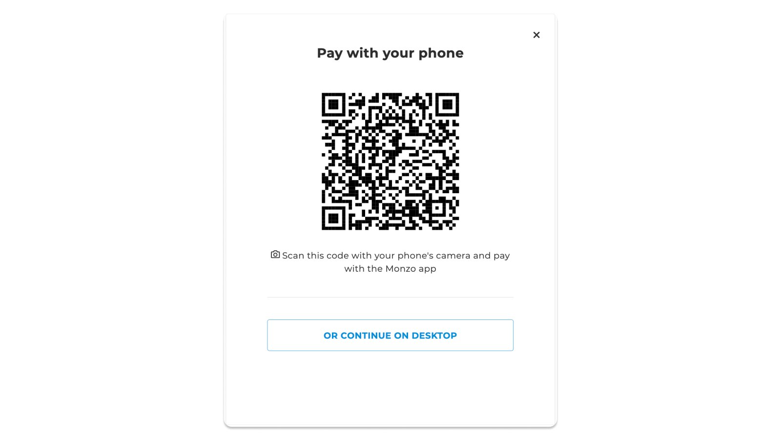
QR codes
For many banks, the authorisation experience is much easier from the bank's mobile app. In these cases, EPP automatically opens the app if the user is on their phone, or falls back to the website if they don't have the app installed. If the user is paying from a laptop, then EPP displays a QR code that the user can scan to launch the payment authorisation in their bank app, or else they can choose to continue to the bank's website on their laptop.
Redirecting in a new tab
If the user is taken to the bank's website to authorise the payment, you can choose where to load the bank's page. By default, the bank page is loaded in the current browser tab, replacing your page. This means that both your page and EPP become invisible. Once they've authorised (or cancelled) the payment, then the user is returned to your website using the return URI that you set at the start of the payment flow.
Alternatively, you can choose to open a new tab for the bank page, so your page and the EPP are still available for the user to switch back to. Once the user has authorised (or cancelled) the payment, then the second tab is automatically closed and the user returns to your page. You can configure your site to react to the user returning, using the same onDone and onAbort callback events.
import { Payment } from 'truelayer-embedded-payment-page'
const payment = Payment({
  payment_id: 'example-string',
  resource_token: 'example-string',
  return_uri: 'example-string',
  open_bank_in_new_tab: true,
})
payment.start()
When you redirect users to a new tab, pop-up blockers can sometimes interfere with the user experience by stopping the browser from opening the second tab. As such, this option might not be right for all scenarios.
Style the EPP user interface
Your name and logo
You can customise your embedded payment page to match the look and feel of your brand. Go to the Payments Customisation section of our developer console to:
- Upload your merchant logo
- Update the application name
When you update these settings, they automatically apply to the embedded payment page.
Basic user interface styling
To make sure the EPP sits well alongside the rest of your page, we provide some simple colour customisation options. Use hex values to define the following colour properties:
| Property | Effect |
|---|---|
defaultColor | Sets a highlight colour that is used throughout the embedded payment page |
spinner | Overrides the default colour to define a specific colour for the loading spinner. |
illustration | Overrides the default colour to define a specific colour for the illustrations used throughout. |

const payment = Payment(const payment = Payment({
    payment_id: 'example-string',
    resource_token: 'example-string',
    return_uri: 'example-string',
    appearance: {
        defaultColor: Color,
        spinner: { color: Color }
        illustration: { color: Color }
    },
    ...
}
Displaying your brand name and logo
Remember to set your UI Customisation options in Console to display:
- Your merchant logo
- Your application name
These are used throughout the embedded payment page.
Extended user interface styling
With additional permissions, you can customise the look of the EPP even further to match your branding.
Special access feature
If you're interested in extended user interface styling, please get in touch with your TrueLayer contact.

Some customisation options can be defined differently for each state the element can be in (default, focus, hover and disabled, alongside active for buttons and list options):
| Element | Styling Options | Element States |
|---|---|---|
button | color: the text colourbackground the background colourborder: color, borderRadius, width, style | defaulthoveractivefocusdisabled |
listOption | color: the text colourbackground the background colourborder: color, borderRadius, width, style | defaulthoveractivefocusdisabled |
input | placeholder: color for the colour of the placeholder text shown inside the input boxlabel: color for the title or label of the input boxicon: color for any icons shown with the input boxborder: color, borderRadius, width, stylebackground: color | defaulthoverfocusdisabled |
font | Set the font name. Choose from any font listed on Google Fonts. | Not applicable. |
import { Payment } from 'truelayer-embedded-payment-page'
const payment = Payment({
  payment_id: 'example-string',
  resource_token: 'example-string',
  return_uri: 'example-string',
  appearance: {
    font: "Roboto"
    defaultColor: '#F0FFFF',
    illustration: { color: '#FF00FF' },
    button: {
      default: { background: '#FF00FF' },
      disabled: { color: '#FF00FF' },
      hover: { background: '#FF0000' },
      focus: {
        border: { color: '#FF00FF', borderRadius: '8px', width: '4px' },
      },
    },
    listOption: { selected: { background: '#7700ff' } },
    input: {
      disabled: {
        placeholder: { color: '#0026ff' },
        label: { color: '#0026ff' },
      },
    },
    input: {
  		default: {
    		placeholder: {
    		  color: Color,
   		 },
   		 label: {
      		color: Color,
    		},
    		icon: {
      		color: Color,
    		},
    		border: {
      		color: Color,
      		borderRadius: CssPropertyValue,
      		width: CssPropertyValue,
      		style: CssPropertyValue,
    		},
    		color: Color,
    		background: Color,
  	 	},
  },
})
UX/UI guides
For guidance on building and customising your own user interface to maximise adoption, conversion and retention, see our UX/UI guides.
Updated 3 days ago